

Application of Machine Learning in clinical trials
The aim is the initial graphical analysis of the diabetic research.
We use Pandas library to prepare the data. Next we will show preliminary conclusions using Seaborn library.
Our research have to show dependencies between selected features of the patients bodies and the incidence of the diabetes.
Data sample that we use in this research with the description you can find here: https://www.kaggle.com/kumargh/pimaindiansdiabetescsv
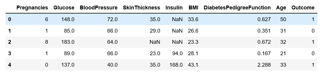
Let’s take a look at our sample
First we are launching all needed Python libraries.
Next we display first ten rows of the data frame.
import pandas as pd
import seaborn as sns
import numpy as np
import matplotlib.pyplot as plt
from matplotlib import style

df = pd.read_csv('c:/1/diabetes.csv')
df.head(10)

For example value of the blood pressure for some patients shows zero. That’s mean the patients were dead during the examination. Similarly, there is impossible lack of the skin thickness or zero value of insulin in the blood.
Contaminated sample is unsuitable to lead further of investigation.
Data table should be cleaned and supplemented by the proper data.
Python has many methods to supplement lack data with mean or dominant.
This is not good for result of our research. Dominant or mean value of sample applied to a particular patient have non sens.
Such solution could lead us to false conclusion. So, we ought to cut out contaminated or cull records.
Let’s see something more about sample
df.dtypes

Now we check how many rows and columns are in the table.
df.shape
![]()
Now we cut-out contaminated and cull records. Probably we lost many records partly usable for our investigation. At the end we obtain only valuable samples.
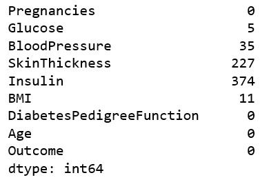
Let’s see how many zero value are in columns: [’Glucose’,’BloodPressure’,’SkinThickness’, 'Insulin’,’BMI’]
(df[['Glucose','BloodPressure','SkinThickness', 'Insulin','BMI']]==0).sum()
To effectively throw out all zero values for selected columns, we have to exchange zero into np.NaN
df[['Glucose','BloodPressure','SkinThickness', 'Insulin','BMI']] = df[['Glucose','BloodPressure','SkinThickness', 'Insulin','BMI']].replace(0,np.nan)
Let’s see what is the change in place of zero values we can see NaN.
We check how many is NaN in selected columns.
df.isnull().sum()
Now we can apply formula who cut out incomplete records. We remove records and display what is the result.
df = df.dropna(how='any')
df.isnull().sum()
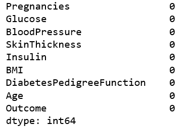
Great, we have clean samples. Now let’s check how many rows we have.
df.shape
![]()
The column 'Output’ contain result of the trial. This column shows whether the patient is diabetic or not. Now we exchange 0, 1 into 'diabetes’ in 'healthy’.
df['Outcome']=df['Outcome'].map({1:'diabetis', 0:'healthy'})
Now our data table looks that.
df.tail(3)

Now with Seaborn library we create big matrix plot. This plot display dependencies between exogenous variables.
sns.pairplot(data=df[['Pregnancies','Glucose' ,'BloodPressure','SkinThickness','Insulin','BMI','DiabetesPedigreeFunction','Age', 'Outcome']], hue='Outcome', dropna=True)
Experienced scientist easily detects anomaly and significant dependencies.

Now we reduce number of variables to better analyze process.
sns.pairplot(data=df[['Glucose' ,'BloodPressure','SkinThickness', 'Outcome']], hue='Outcome', dropna=True, height=3)
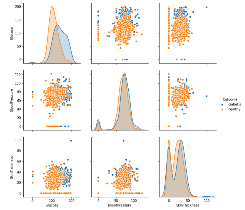
We can easily detect most effective variable is level of glucose in the blood. Blue points on the plot show, diabetes appear after exceeding a certain level of glucose.
Great, but just main symptom of diabetes is high level of glucose in the blood. This is obviously, conclusion that lead to nothing. Unfortunately medicine is not my profession.
Let’s try again.
Our aim is to detect most significant medical parameters causes diabetes.
Now we check look down other exogenous variables. We change a little colors and form.
Now we check look down other exogenous variables. We a little change colors and markers form on the plot.
sns.pairplot(data=df[['Insulin' ,'Age','SkinThickness', 'Outcome']], hue='Outcome', dropna=True, height=2.5, palette=('husl'), markers='x')
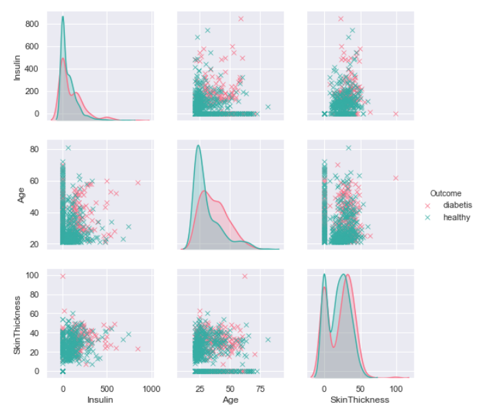
We can display this plot in another form.
g = sns.PairGrid(data=df[['Insulin' ,'Age','SkinThickness', 'Outcome']], hue='Outcome', dropna=True, height=3)
g = g.map_upper(plt.scatter)
g = g.map_lower(sns.kdeplot)

We can observe that the incidence of diabetes is affected by age of patient and level of insulin in the blood. It is visible thanks to change of the dots colors.
g = sns.pairplot(data=df[['Insulin' ,'Age','SkinThickness', 'Outcome']], hue='Outcome', dropna=True, height=3, aspect=2, palette=('cubehelix'), markers='o')
g.axes[2,1].set_xlim((0,140))
g.axes[1,2].set_xlim((0,60))
