
")
It is easy to make normal distribution but how to visualization of normal distribution experiments?

For everybody who come here only for pure plot i have a code:
from scipy.stats import norm
import numpy as np
import matplotlib.pyplot as plt

x= np.arange(-3,3,0.05)
plt.plot(x, norm.pdf(x))

plt.show()
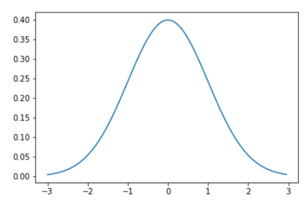
Visualization of normal distribution experiments
For everybody who interested in experiments with normal distribution in Python I invite to below code:
import numpy as np
import pandas as pd
import random
import matplotlib.pyplot as plt

# we get same random numer 42
np.random.seed(42)
# number of trial in one experiment
n = 7
# Probability of defined phenomen. Throw a coin: likelihood to get head is 50
p = 0.5
# The coin was thrown 7 times. Three times was hit head.
np.random.binomial(n, p)
3
Explanation
Experiment on the normal distribution according to classical approach has poor quality if it is done couple of times. Quality of statistic experiment increase when experiment is repeat hundreds of times.
Below module gives possibility to define number of repeat.
Experiment of 7 times of throw will be repeated defined number of times (for example 100 times).
size=100
x=np.random.binomial(n=n, p=p, size=size)
print(x)
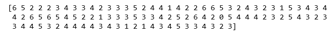
This matrix shows of results of 100 repeats experiment. Each experiment consists on 7 throws of coin. In first experiment was 6 heads on the 7 throws.
[np.equal(x,i).sum() for i in range(n)]
![]()
Explanation
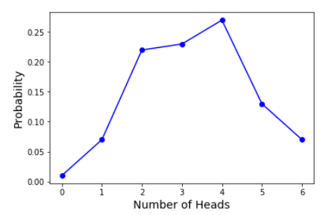
There are 7 throws of one experiments. This code show how many heads were on 7 throws of coin.
First position is 1, that mean one time was 1 head for 7 throws in 100 repeats of experiment. Second position is 7, that mean 7 on 100 repeat times was 2 heads on 7 throws.
Third position is 22, that mean 22 times on 100 repeats of experiment, was 3 heads on 7 throws.
23, that mean 23 times was 4 on 100 repeats of experiment that consisted of 7 throws of coin.
probs = [np.equal(x,i).mean() for i in range(n)]
print(probs)
![]()
This is probability of results. For example 23 times was 3 head in experiment of 7 throws repeated 100 times. So we take 23/100 = 0.23 of likelihood.
plt.xticks(range(n))
plt.plot(list(range(n)), probs, color='blue', marker='o')
plt.xlabel('Number of Heads',fontsize=14)
plt.ylabel('Probability',fontsize=14)
At the end usefull function.
a = np.array([1, 2, 3, 4, 5])
b = np.array([1, 3, 2, 4, 5])

np.equal(a,b)
![]()
np.equal(a,b).mean()
0.6
0.6, that mean of level of fit two arrows. Three numbers was the same, two was inconsistent.
Visualization of normal distribution experiments.